Background
Today, many older adults take medications as part of their daily routine. For some, it's just vitamin supplements, while others rely on pill boxes with dosages divided for different times of the day, each with its own instructions. Some remember to take their medications and continue with their day, while others find medication management time-consuming, or they rely on family members to ensure the medications are taken on time and as directed.
The challenge
Creating a User-Friendly App Interface Tailored Precisely to the Target Audience! The idea is to define and design, in collaboration with the development team, a medication reminder app that provides an accurate solution for timely medication intake. The app will also offer additional solutions for users, supporting not only the management of their medications but also everything related to medication inventory and medical assistance.
Research
At the outset, the research was divided into 4 parts:
General research
Research on the World of Medications: Medication Intake Among Older Adults, Age Groups, and Technological Knowledge in Advanced Age.
1
target audience
The target audience for the app is divided into two groups: Older adults aged 60 and above, up to 80. Authorized individuals (such as family members or caregivers) who can access the account of the older adult and assist them in managing their medications, reminding them to take their medications without requiring too much interaction with the app.
2
Interviews
I conducted interviews with a diverse group of individuals: Older adults aged 60 and above. 2. Older adults aged 80 and above. 3. Foreign caregivers and individuals who assist their elderly parents.
3
Surveys
Surveys were conducted with individuals who assist their elderly parents to understand the level of support they provide and their ability to manage remotely—including the use of the app and more.
4
User journey
After researching the world of medications for older adults, I defined my target audience. I conducted interviews and surveys and created personas. Here is the primary persona.
User journey
After defining the persona, I created a journey map that helped connect with another persona and, most importantly, gain a deeper understanding of their needs.
Flow
I created several flows for this app. Below is the main flow of the app, where the user checks their medications and chats with the doctor.
Inductions
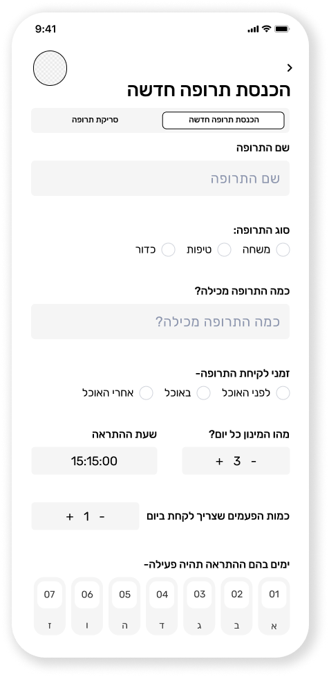
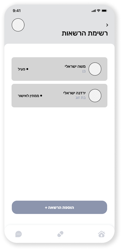
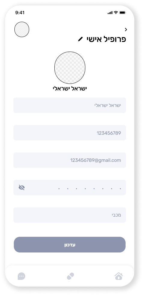
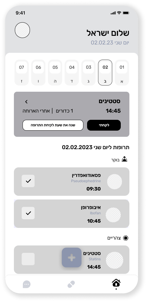
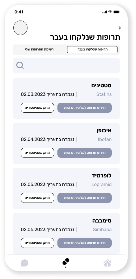
After all this I created the names of screens + their content - information architecture and then I created the wireframe with a great emphasis on maximum user experience and in addition I went through hundreds of inspirations in order to understand, see and learn what is the best way for this application.
Design System
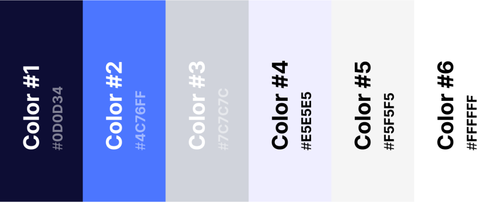
After creating the component, I transitioned to designing the app. It was essential for me that, just as the app's interface is easy, simple, and user-friendly, the design should also be highly functional. Therefore, I selected a soft and stable color palette that effectively serves its purpose, while the CTA color stands out prominently to encourage action. The user interface is intuitive, ensuring a seamless experience for users as they navigate through the app.
colorfulness
Typography
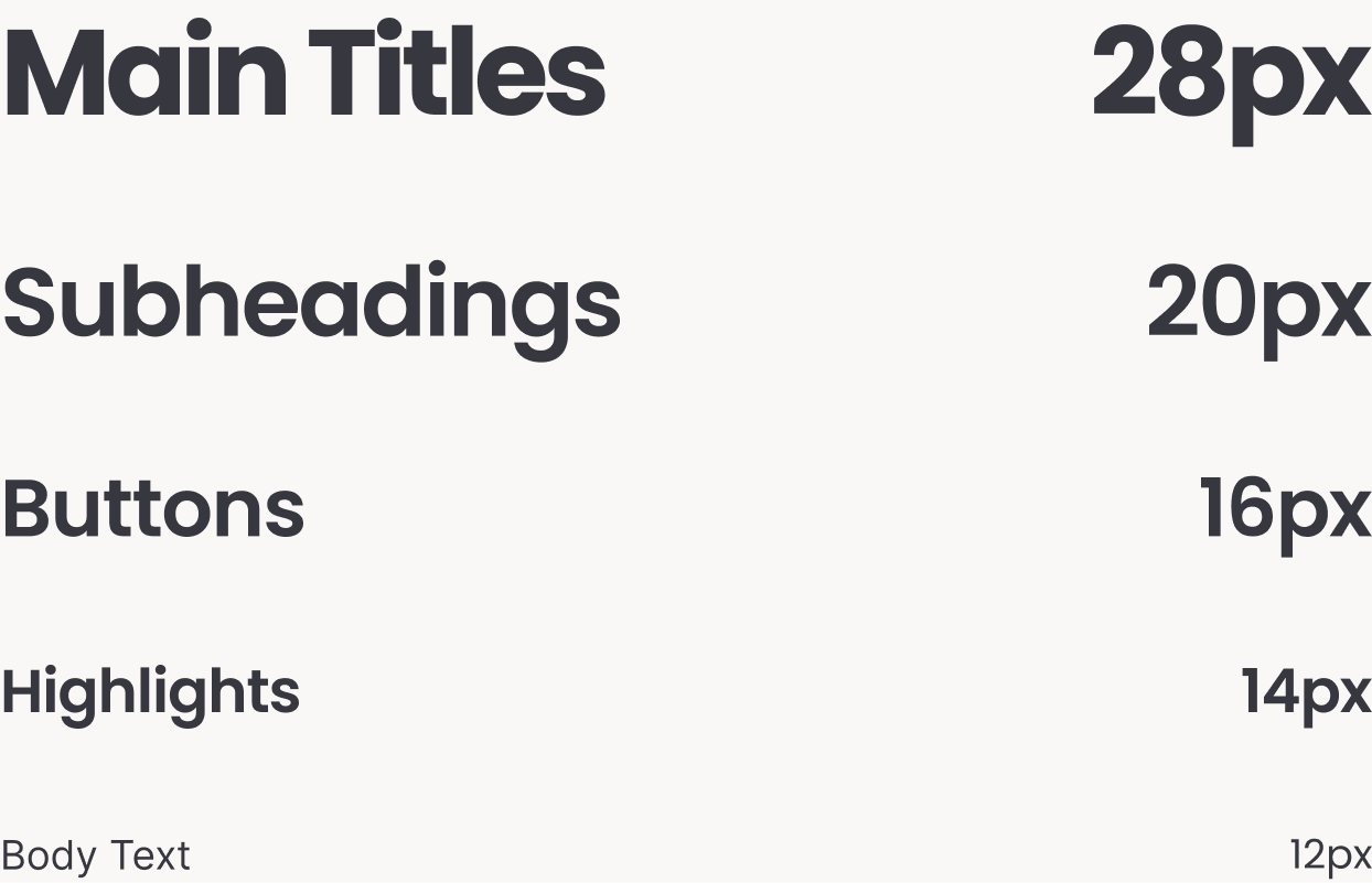
The font I chose to design the interface with is a font Rubik.
Buttons & Fields
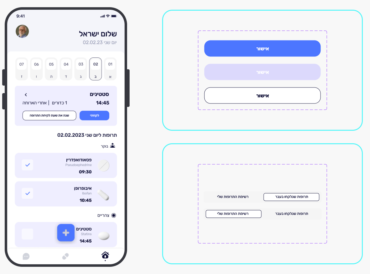
I created the buttons, tabs, and other components to be prominent, clear, and functional.
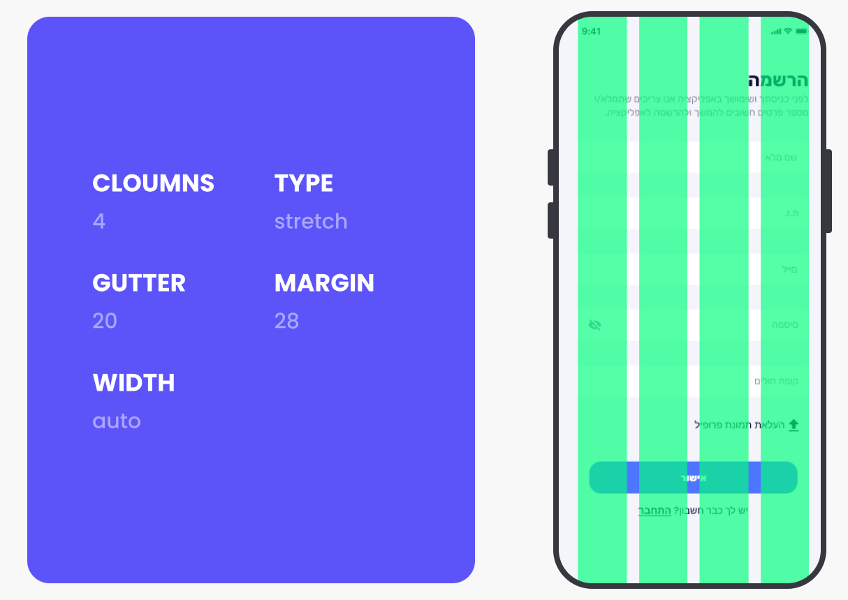
The Grid
The grid was such an important component in the process! It created spacing and conveyed a sense of comfort and order.
The App
After an in-depth process involving numerous sketches, along with a precise design based on a meticulous grid system and maintaining consistency across the screens, I am happy to present the final result – an interface that seamlAnd after all the process, the inspirations, the wireframes, and the design — the creation of the language and the screens themselves, here is the app before you!essly combines aesthetics and functionality.