Background
Monday.com serves both large and small companies in managing long-term projects. It offers tools for time management and task boards, enabling reminders and navigation according to schedules. Additionally, it includes advanced automations, integrations with external tools, and comprehensive reporting capabilities that make project management efficient and precise. However, during the use of Monday, there is a sense of a lack of social engagement that could help boost motivation and investment from team members. The goal of this project is to develop a new feature that introduces a process not currently available in the system.
The challenge
The challenge was to streamline project management by improving the daily work experience, enhancing internal communication, social interaction, and boosting team members' motivation and engagement. To achieve this, I designed and developed an innovative feature within the system, maintaining a simple, consistent, and user-friendly experience that keeps team motivation high throughout the project. The feature allows the project manager to reward employees with benefits through an easy-to-use interface, simplifying the process and making it an enjoyable experience
Research
At the outset, the research was divided into 4 parts:
General research
A general study on employee rewards, an exploration of the Monday.com system, and an understanding of its smart functionality and operational methods.
1
target audience
At this stage, I conducted several interviews and reviewed others, which highlighted how small gestures of attention towards employees—such as a benefit, gift, or easing of tasks—significantly boost their motivation. This fosters genuine enthusiasm and enjoyment, making employees eager to come to work each day with a sense of fulfillment.
2
Interviews
Interviews were conducted with several individuals from the target audience across different age ranges to understand their needs, goals, and especially their desires.
3
Surveys
At this stage, I already had a lot of information, but it was important for me to understand the finer details, especially regarding employee benefits. Since this is a topic that varies from region to region, I wanted to explore it further and gain a deeper understanding of its impact and preferences in different areas.
4
User journey
After all the initial research, I created two personas: the first is the team leader, responsible for setting the order and distribution of projects and entering deadlines into the Monday.com system. The second is a team member, who receives their work plan and schedule from the team leader in Monday. Here, we will focus on the team leader, who, in addition to assigning projects and deadlines, will be able to provide rewards to the team members under their supervision through the new feature during the course of the project.
User journey
After defining the persona, I created a journey map that helped connect with another persona and, most importantly, gain a deeper understanding of their needs.After defining the persona, I created a journey map that helped connect with another persona and, most importantly, gain a deeper understanding of their needs.
Flow
I created several flows for this system. Below is the main flow of the system:
Inductions
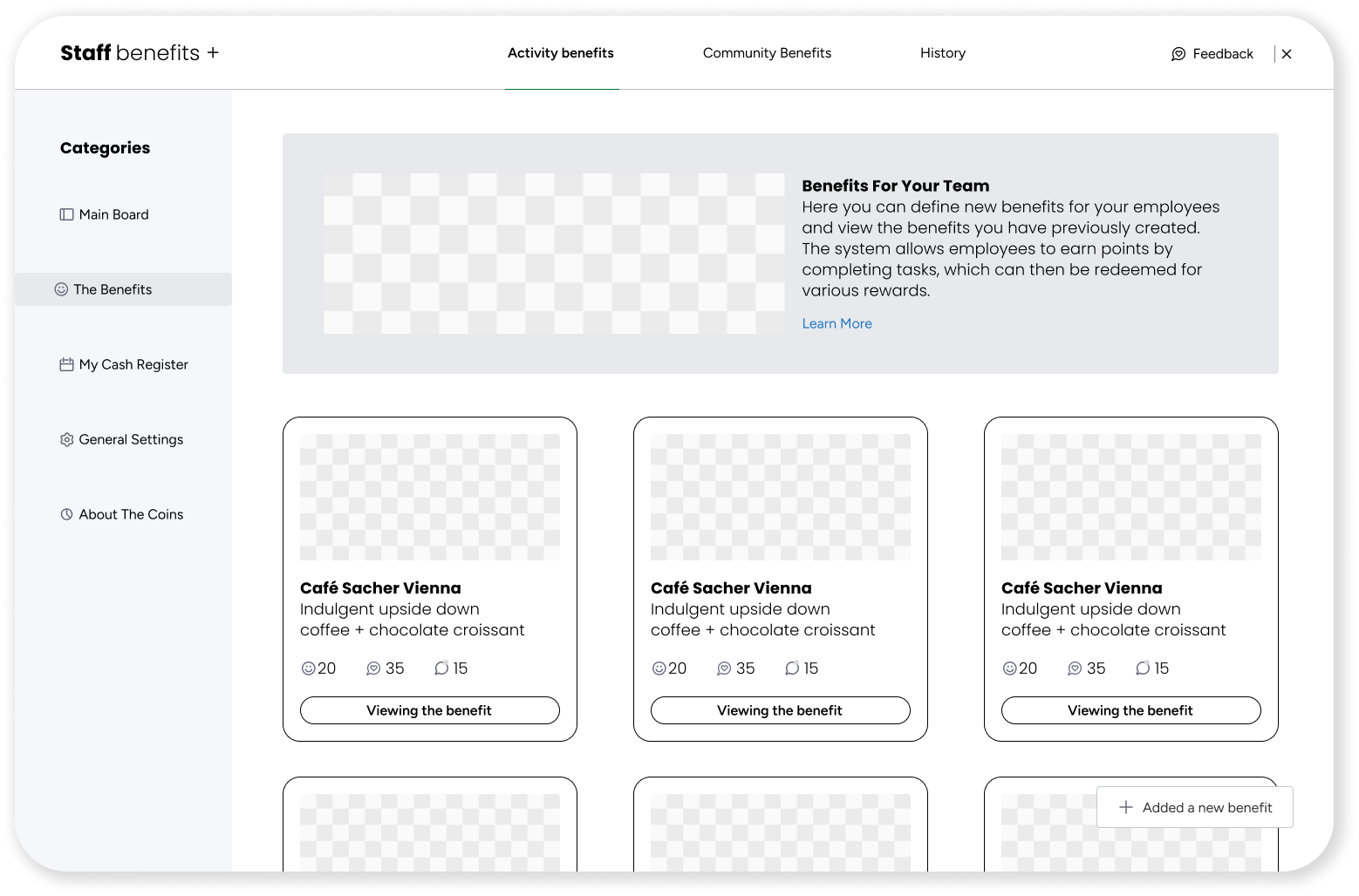
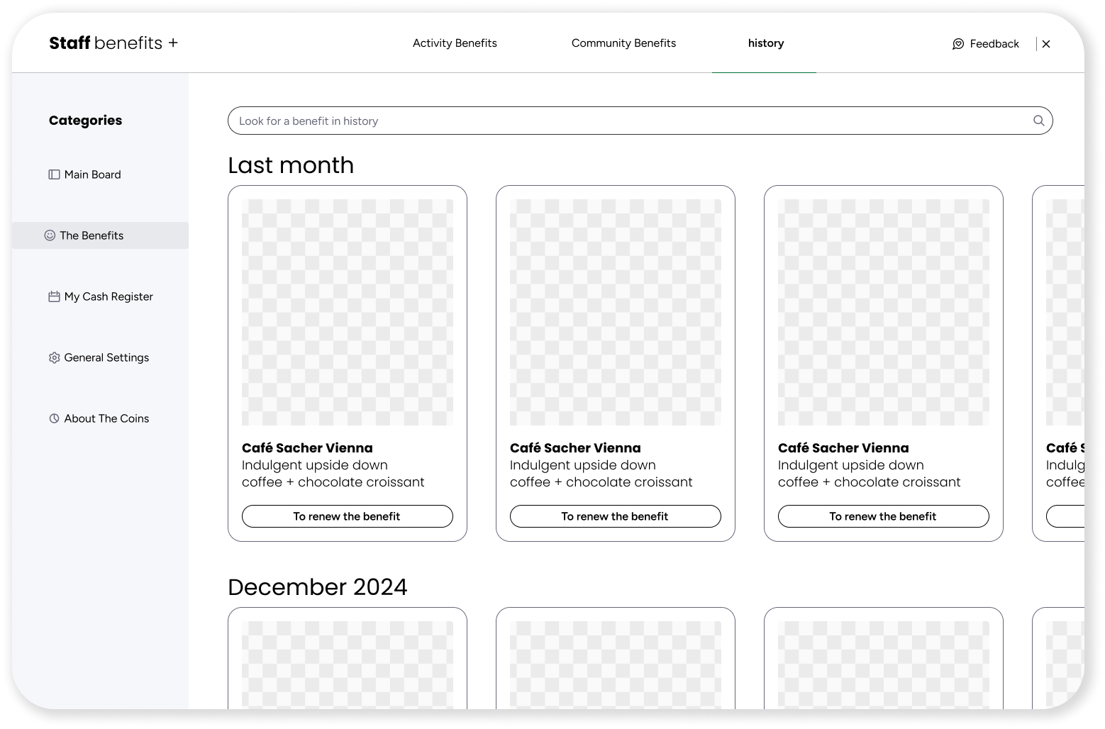
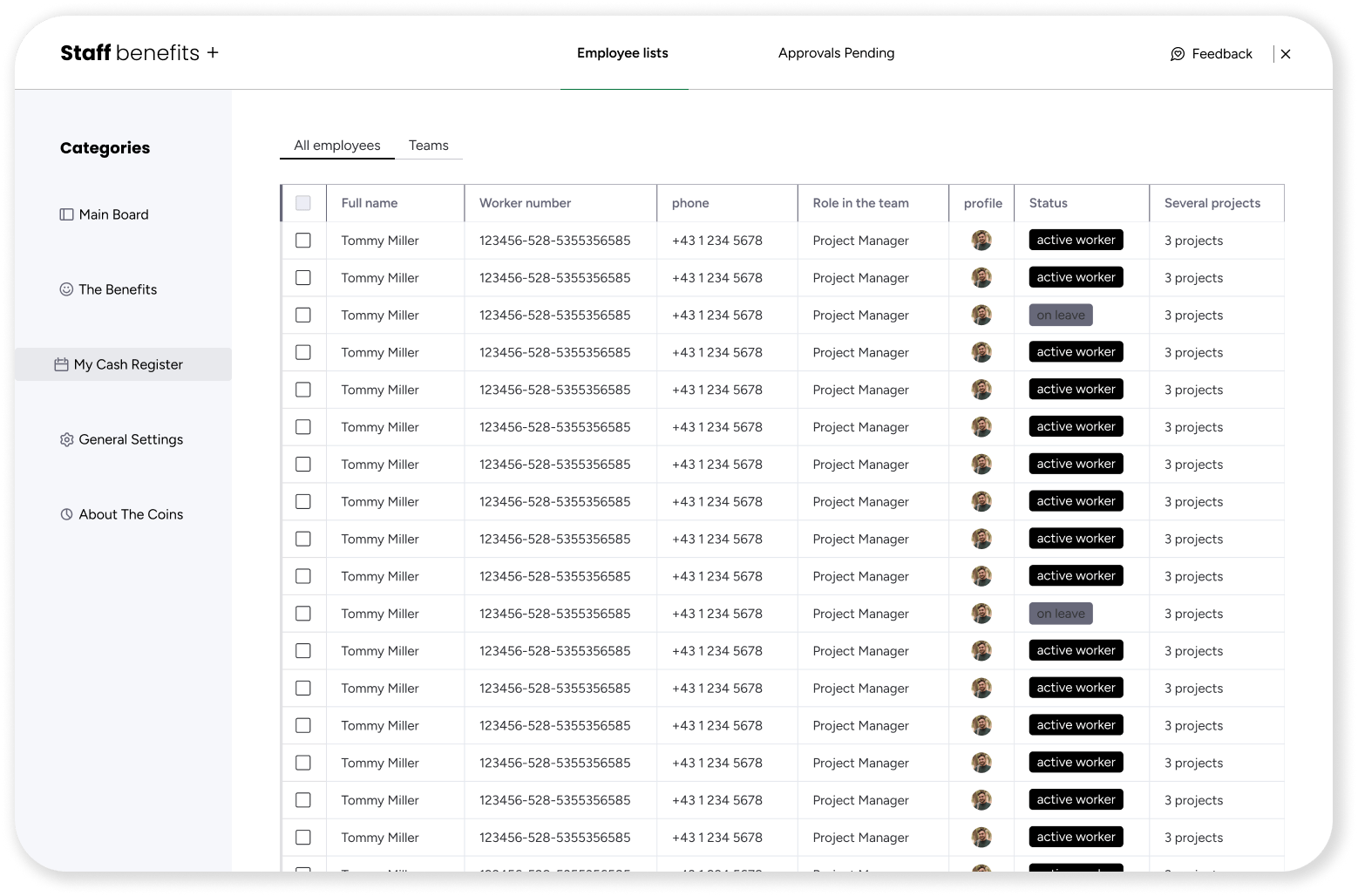
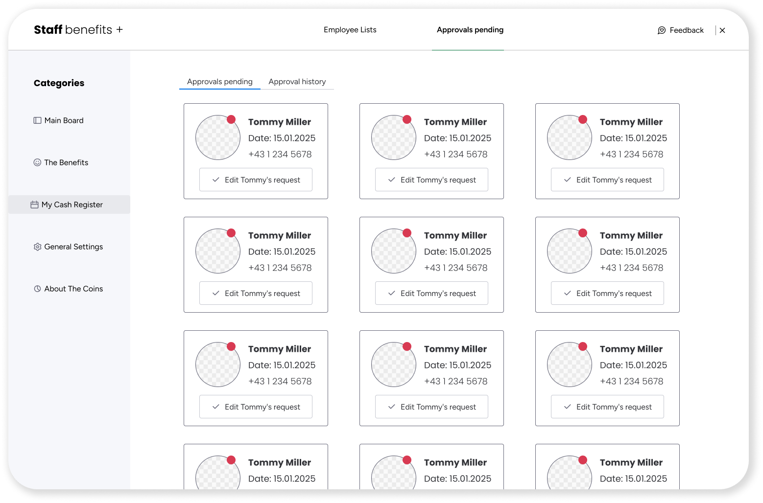
After all this, I created the screen names and their content – information architecture, and then I designed the wireframe with a strong emphasis on maximizing user experience. Additionally, I reviewed hundreds of sources of inspiration to understand, observe, and learn the best approach for this system.
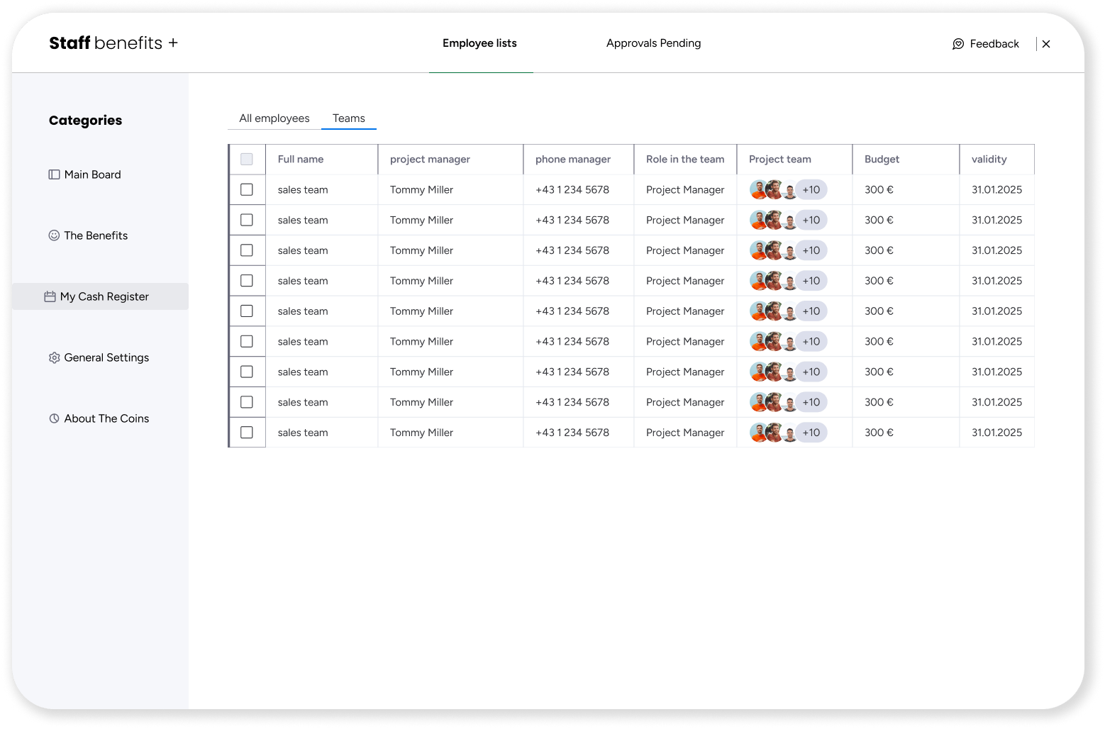
Design System
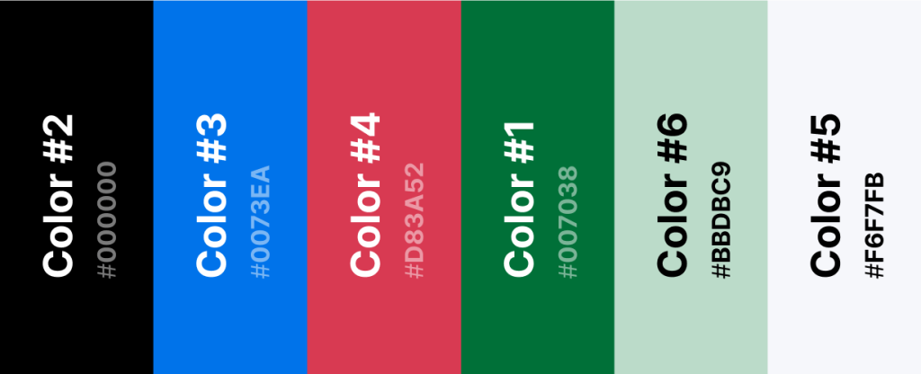
After completing the wireframe phase and gathering inspiration, I began designing the visual language, which was largely inspired by the global Nike brand. The goal was to create a parallel design language, making the product feel like a natural extension of the Nike brand.
colorfulness
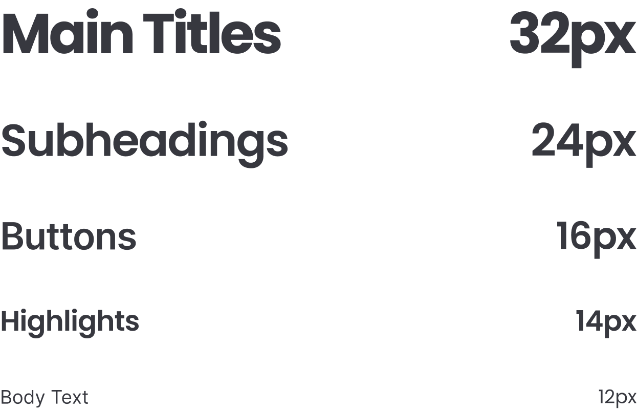
Typography
The font I chose to design the interface with is a font Poppins.
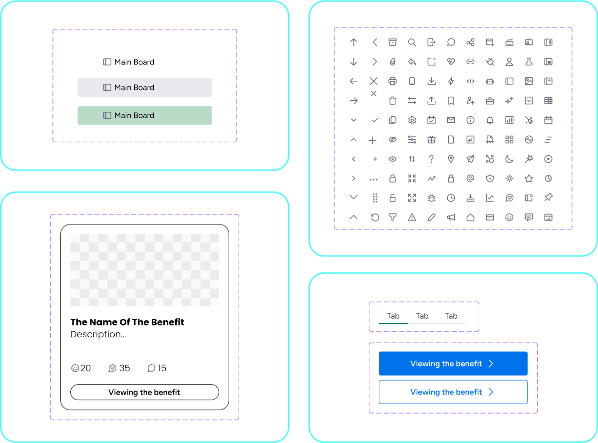
Buttons & Fields
The design of the cards, buttons, and the entire system was meticulously crafted to provide a simple, efficient, and user-friendly experience. At the same time, great attention was given to creating a smart and polished design that enhances both the visual appeal and functionality of the system.
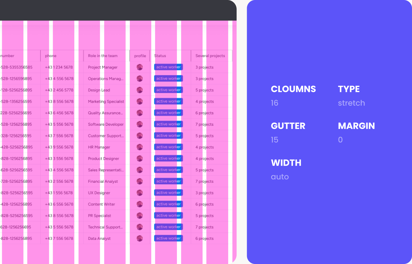
The Grid
During the design process, the grid was an important element for maintaining consistency and creating a beautiful, good, and functional interface.
The App
After an in-depth process involving numerous sketches, along with a precise design based on a meticulous grid system and maintaining consistency across the screens, I am happy to present the final result – an interface that seamlessly combines aesthetics and functionality.