Background
Nike, the global leader in fashion, is renowned for its wide range of high-quality apparel, particularly its iconic shoes worn by millions around the world. In recent years, a new trend has emerged among Nike enthusiasts who seek to express themselves creatively through custom-designed shoes featuring artistic illustrations. In response to this trend, I created an innovative app that allows users to design and create their dream Nike shoes, maintaining the brand’s quality and style while expressing their individuality.
The challenge
Creating an app that offers a solution for custom shoe creators and Nike enthusiasts. The app provides a smooth user experience with a quick and easy process, allowing users to design the perfect shoe with minimal effort and the option for direct home delivery. Additionally, the app connects community members and facilitates the sale of unique shoes among them.
Research
At the outset, the research was divided into 4 parts:
General research
General research on the world of shoes, particularly Nike shoes, including shoe designs and understanding the fashion and trends associated with footwear.
1
target audience
Young individuals aged 17-35 with a passion for fashion and uniqueness, seeking ways to express their personal style and willing to invest financially in high-quality, well-designed products.
2
Interviews
Interviews were conducted with several individuals from the target audience across different age ranges to understand their needs, goals, and especially their desires.
3
Surveys
To better refine and gain a deeper understanding of users' needs, desires, and fears in a broader context, I conducted a survey with hundreds of participants. From this survey, I derived numerous insights and valuable conclusions for the app's development.
4
User journey
After researching the world of footwear, I defined my target audience.
I conducted interviews and surveys, and created personas. Here is the main persona.
User journey
After defining the persona, I created a journey map that helped connect with another persona and, most importantly, gain a deeper understanding of their needs.
Flow
I created several flows for this app. Below is the main script of the app, in which the user designs a
shoe to their personal taste.
Inductions
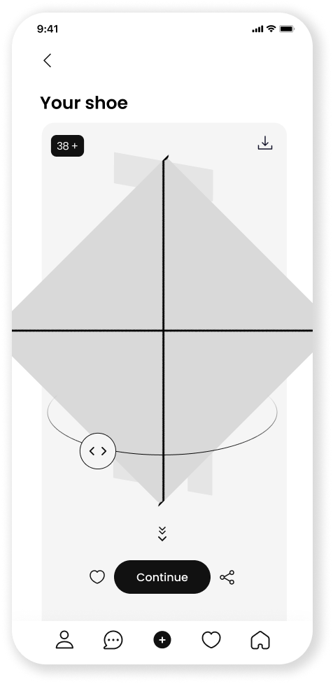
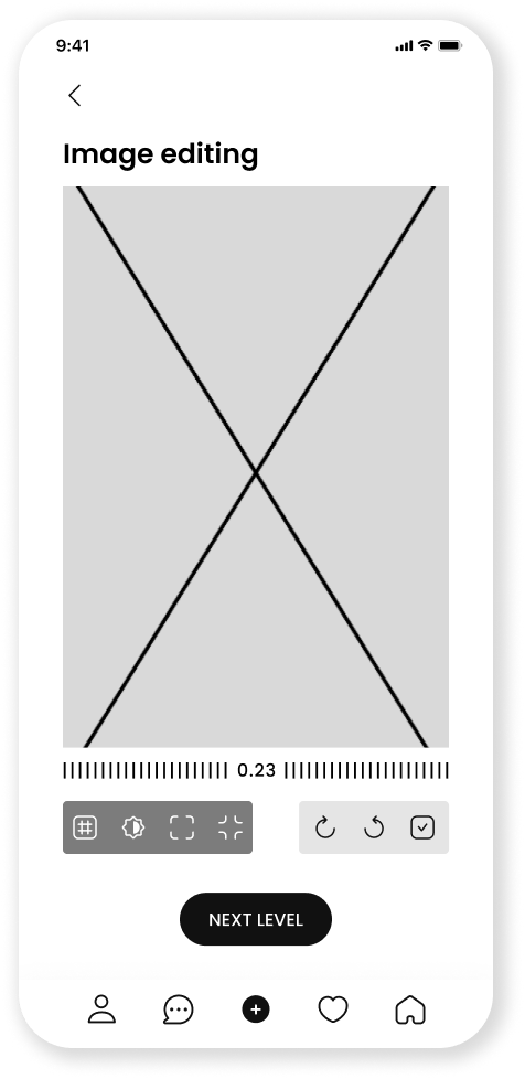
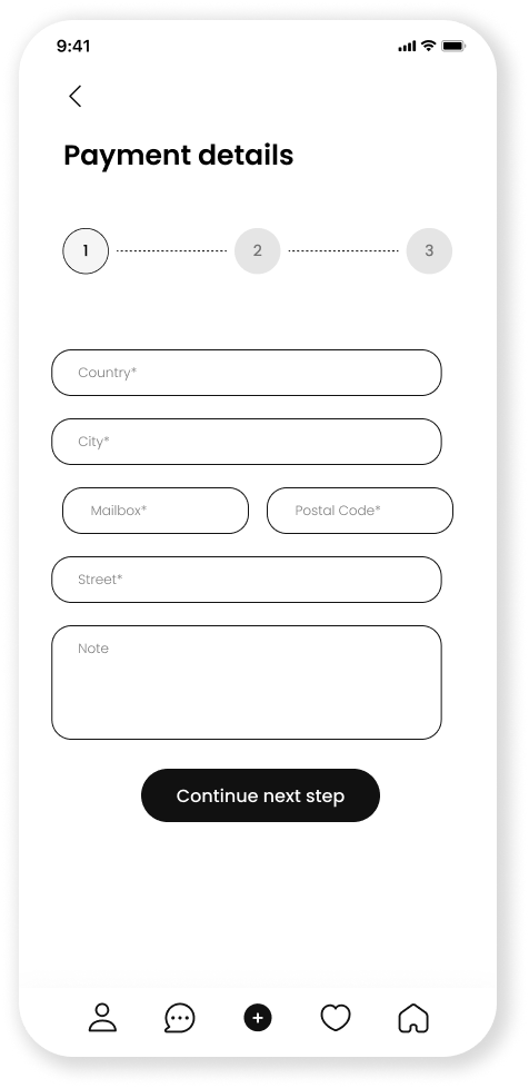
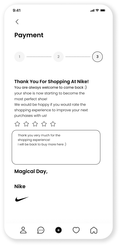
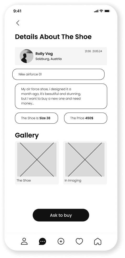
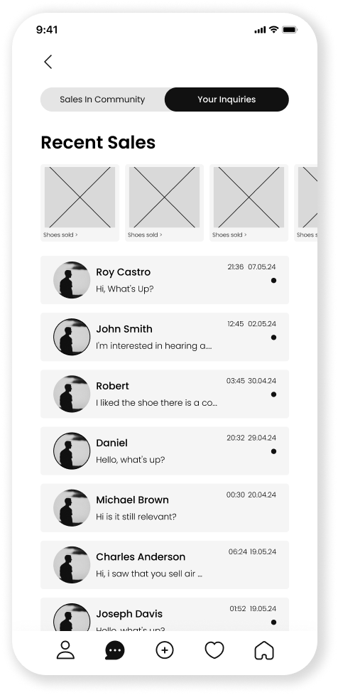
After all this I created the names of screens + their content - information architecture and then I created the wireframe with a great emphasis on maximum user experience and in addition I went through hundreds of inspirations in order to understand, see and learn what is the best way for this application.
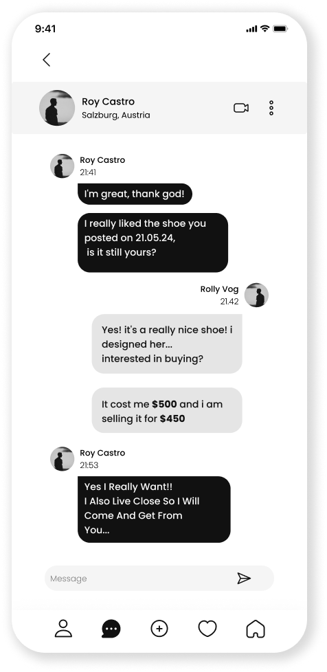
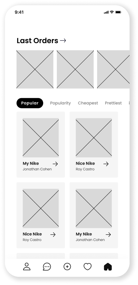
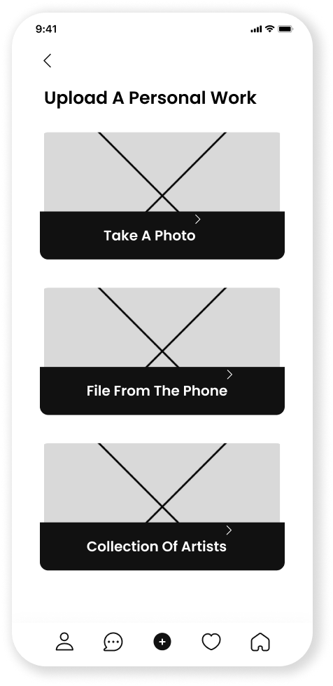
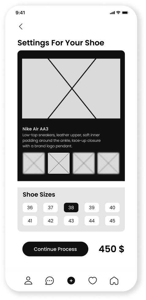
Design System
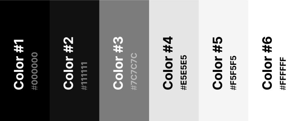
After completing the wireframe phase and gathering inspiration, I began designing the visual language, which was largely inspired by the global Nike brand. The goal was to create a parallel design language, making the product feel like a natural extension of the Nike brand.
colorfulness
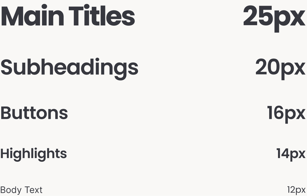
Typography
The font I chose to design the interface with is a font Poppins.
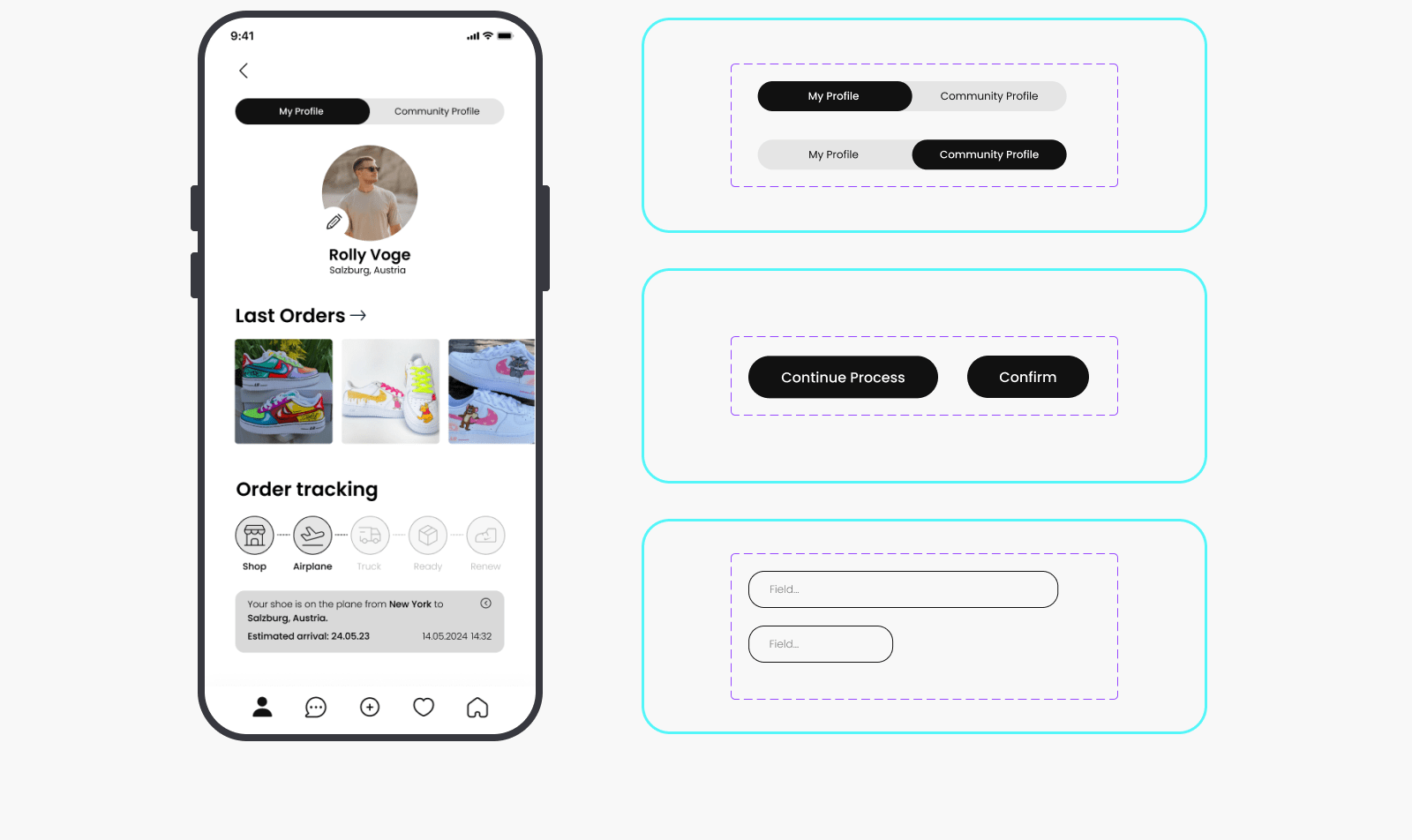
Buttons & Fields
I created very minimalist buttons that are clear and simple and call to action, Similar to the Nike company, I took a lot of inspiration from the name of the buttons, which are minimalistic and clear to the user on a call to action
The Grid
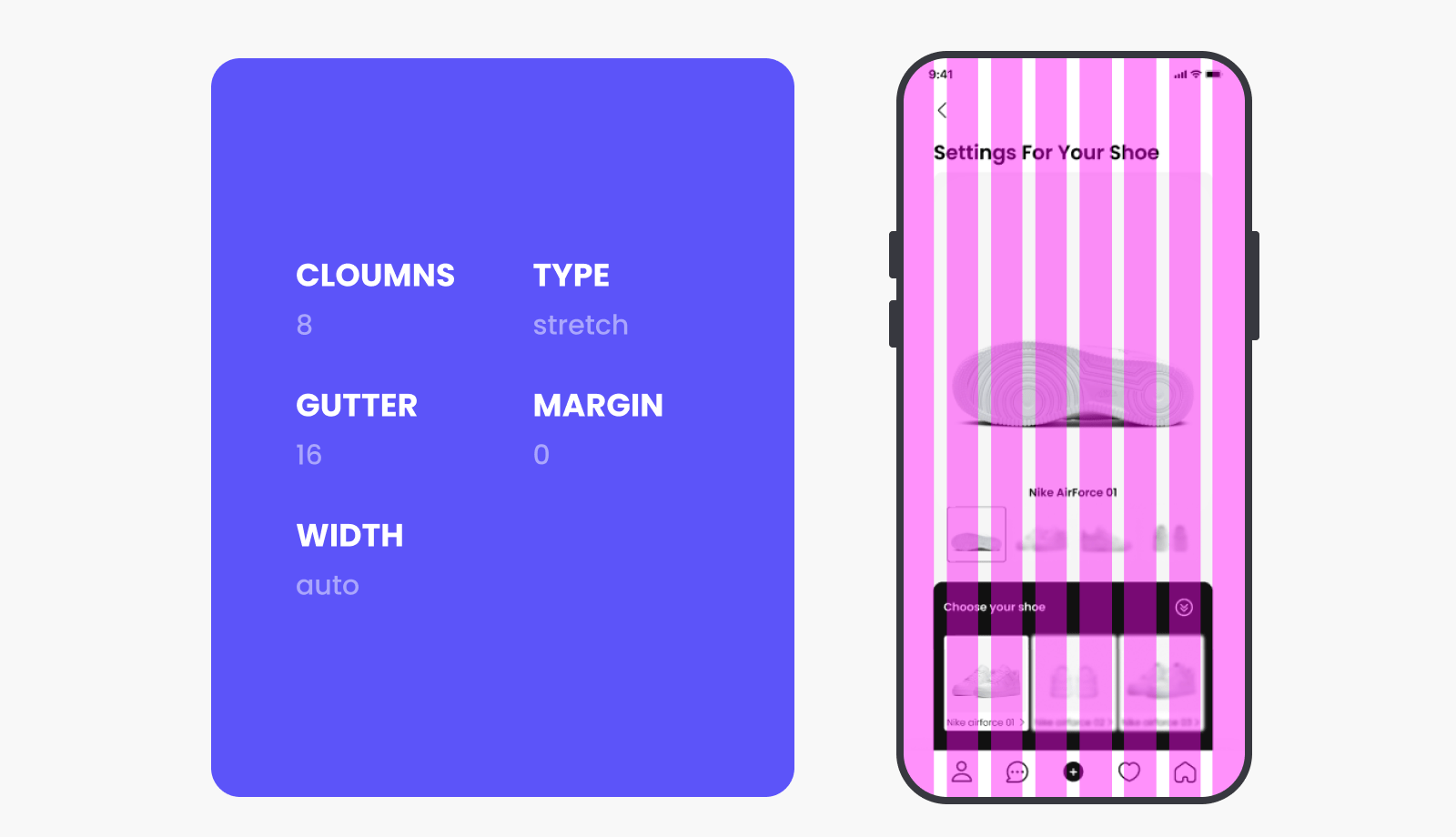
During the design process, the grid was an important element for maintaining consistency and creating a beautiful, good, and functional interface.
The App
After an in-depth process involving numerous sketches, along with a precise design based on a meticulous grid system and maintaining consistency across the screens, I am happy to present the final result – an interface that seamlessly combines aesthetics and functionality.